
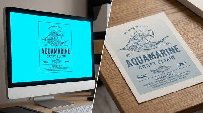
You spend hours perfecting your label design on your computer. The colors look vibrant and exactly right. Then the printed labels arrive and something’s off — the bright blue is duller, the vivid green has shifted, the orange looks brownish. What happened?
The Fundamental Problem
Your screen and your printer speak different color languages. Computer monitors use RGB (red, green, blue) — they create colors by mixing light. The more light you add, the brighter the color. Printers use CMYK (cyan, magenta, yellow, black) — they create colors by mixing ink on paper. The more ink you add, the darker the result. These two systems don’t produce identical color ranges.
The Color Gamut Gap
RGB can display colors that CMYK physically cannot print — particularly very bright, saturated blues, greens, and oranges. When an RGB file is converted to CMYK (which happens at some point in every print job), those out-of-gamut colors get “compressed” into the nearest printable equivalent. The result is usually a less vibrant version of what you saw on screen.
How to Prevent Color Surprises
Design in CMYK from the start. Set your document color mode to CMYK in your design software before you begin. This way, you’re only working with colors that can actually be printed. Don’t trust your screen. Even in CMYK mode, your monitor is still displaying in RGB — it’s simulating CMYK. For color-critical projects, request a printed proof and evaluate colors under consistent lighting. Use Pantone references when exact color matching matters. If your brand has specific colors that must be exact (like a logo color), communicate the Pantone (PMS) number to your printer.
Still unsure about your colors? Talk to our team — we can review your artwork and flag potential color issues before printing.